
Point of Sale Display Solutions: How to Increase In-Store Sales with Smarter Displays
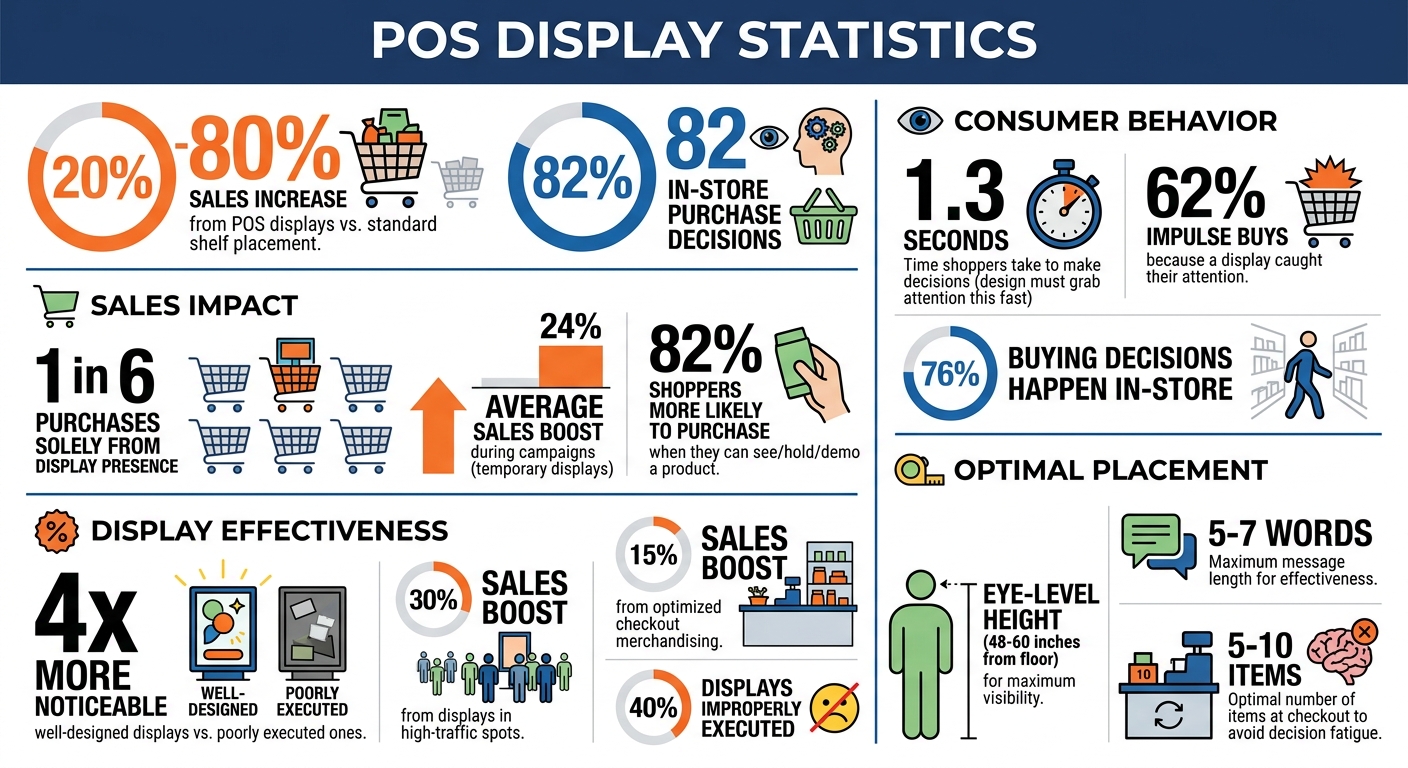
Point-of-sale (POS) displays can directly increase in-store sales by 20% to 80%. These displays, placed in high-traffic areas like checkout counters, spotlight products and encourage impulse purchases. With 82% of purchase decisions made in-store, the design and placement of POS displays are critical.
To maximize their impact:
- Design matters: Use clear visuals, consistent branding, and simple messaging to grab attention in just 1.3 seconds.
- Placement is key: Position displays in high-visibility areas like entrances, checkout zones, or near fitting rooms.
- Technology boosts engagement: QR codes, digital screens, and interactive features can enhance customer interaction.
- Track performance: Monitor metrics like sales uplift, engagement rates, and inventory turnover to refine and improve results.
POS displays are a powerful way to turn overlooked store spaces into revenue drivers. By combining smart design, effective placement, and performance tracking, you can boost sales and improve the shopping experience.
POS Display Impact Statistics and Key Performance Metrics
POS Display Basics
What Are POS Displays?
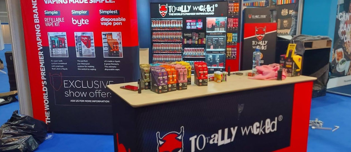
Point-of-sale (POS) displays are promotional tools placed right where transactions happen – checkout counters, service desks, and payment lines. Unlike general store displays, these are positioned in the checkout area, where shoppers are already in the process of completing their purchases.
These displays are designed to spotlight products, create a sense of urgency, and encourage last-minute additions to a shopper’s basket. Typically small and compact, they fit neatly on counters and often feature items like candy, batteries, travel-sized products, or seasonal goods that are easy to grab. The main distinction lies in their location – POS displays are strictly at transaction points, while broader point-of-purchase (POP) displays are found throughout the store, such as on endcaps, in aisles, or near entrances. This strategic placement is key to their effectiveness, as we’ll see next.
Why POS Displays Increase Sales
Now that we’ve covered what POS displays are, let’s dive into how they impact consumer behavior. At checkout, customers are already committed to buying, making them more likely to grab affordable, impulse-friendly items like gum or phone chargers.
The numbers back this up. Studies show that one in six purchases happens solely because a display was present. Additionally, 62% of shoppers admit they’ve made an impulse buy because a display caught their attention. Temporary displays, often used during marketing campaigns, can boost sales by an average of 24%. Even more compelling, shoppers are 82% more likely to purchase a product when they can see, hold, or demo it – something a well-designed display makes possible.
“In a sea of brand names for lightbulbs, electronics, and more, inline point of purchase displays cut through the clutter and draw attention to specific companies and products on a shelf.” – Joe Poborsky, Model Maker, Frank Mayer
The magic of POS displays lies in their simplicity. Instead of competing with an overwhelming number of products on crowded shelves, these displays give a product its own spotlight. They signal to shoppers that the item is new, on sale, or worth trying, cutting through the visual chaos and making the decision to buy much easier.
sbb-itb-b68070b
How to Design Effective POS Displays
Using Visual Hierarchy and Brand Elements
When it comes to POS displays, first impressions are everything. Shoppers make decisions in mere seconds, so your design needs to grab attention fast.
Start with a clear visual hierarchy. Place your brand name high enough to stand out across aisles. Position product images at eye level – between 48 and 60 inches from the floor – for maximum visibility. Your call-to-action (CTA) should be easy to spot and naturally positioned where customers reach. Keep the message short and punchy – five to seven words max. For instance, instead of a lengthy phrase like “Experience the revolutionary new formula that transforms your skincare routine”, go with something like “Smoother skin in 7 days.”
Consistency in color is also key. Shoppers notice when display colors don’t match your packaging, even if they can’t articulate why. To avoid this, work with your production partners to ensure Delta E values stay below 2.0 for color matching. Beyond consistency, color choice matters: warm tones like red and yellow can evoke urgency, while cool tones like blue and green suggest calmness or a premium feel.
Once your visual elements are aligned, the next step is selecting the right size and layout for your display.
Choosing the Right Display Size and Layout
Countertop displays are ideal for smaller spaces. Keep them compact – under one square foot – and angle them so products face customers as they approach. This ensures visibility without cluttering the area.
Freestanding displays, typically 48–72 inches tall, work well in high-traffic areas. They’re large enough to grab attention but not so big that they overwhelm the space. For tighter spots, sidekick displays are a smart choice. These attach to endcaps, boosting visibility without taking up extra floor space.
Don’t underestimate the power of white space. A crowded display can overwhelm shoppers, while thoughtfully spaced-out products can feel more luxurious. If your brand leans toward affordability or discounts, a denser arrangement might better communicate value. Choose a layout that reflects your brand’s identity and messaging.
Once the physical setup is complete, focus on curating the right mix of products.
Limiting Product Choices to Simplify Decisions
Too many options can confuse or overwhelm shoppers. Instead of showcasing your entire product line, use your POS display to highlight specific collections or new launches. This approach combats “brand blindness”, where shoppers tune out products they’ve seen too often.
Curate a selection that fits a clear theme, such as “Summer Essentials”, “New Arrivals”, or “Travel Size Favorites.” A focused display not only simplifies decision-making but also gives customers a reason to stop and explore your offerings.
Where to Place POS Displays for Best Results
Identifying High-Traffic Store Areas
To get the most out of your POS displays, focus on high-visibility spots like store entrances, checkout counters, and busy aisles. These areas naturally draw more attention, giving your products the exposure they need.
“Identifying high-traffic areas within stores and strategically placing displays maximize visibility.” – Movista
Data can be a game-changer here. By analyzing store hotspots – like frequently visited aisles or zones where customers linger – you can pinpoint the best places for your displays. Considering that about 76% of buying decisions happen in-store, smart placement can directly impact sales.
Another key tip: position displays at eye level, typically 4–5 feet off the ground. This “buy level” is where shoppers naturally focus, making it perfect for showcasing new products or high-margin items. Once you’ve identified these hotspots, adapt your display strategy to fit the specific retail environment.
Placement Tips for Different Store Types
Different types of stores call for different display approaches. For instance:
- Club Stores (e.g., Costco): Use large pallet displays near the entrance to highlight value and grab attention in open, warehouse-style layouts.
- Convenience Stores: Compact countertop displays at registers and endcap units in key aisles are ideal for catching customers on the go.
- Clothing Stores: Place displays near fitting rooms or alongside complementary products. For example, accessories near dressing rooms can encourage add-on purchases.
- Pharmacies: Cross-merchandise by placing travel-sized toiletries or similar items near the pharmacy counter where customers often wait.
- Tech and Beauty Retailers: Opt for sleek, interactive displays that reflect a premium feel. Clean designs with plenty of white space help maintain a high-end look without overwhelming shoppers.
Beyond tailoring to store types, don’t overlook the power of checkout areas for driving last-minute sales.
Using Checkout Areas for Last-Minute Purchases
Checkout zones are prime real estate for impulse buys. Shoppers are already engaged, making it the perfect spot for quick, easy purchases. Keep it simple by limiting displays to 5–10 items – this helps avoid decision fatigue. Stock these areas with grab-and-go products like gum, candy, or travel-sized essentials.
Tiered countertop racks work well for showcasing multiple items without creating clutter. If your store has a defined queue, consider adding shelves or bins near the line. One hypermarket chain saw a 15% sales boost simply by rethinking its checkout merchandising strategy.
Place your most profitable items closest to the register for easy access, and use clear, action-driven signage like “Grab one before you go!” This not only encourages quick decisions but also makes the process feel seamless. Done right, checkout displays can even pave the way for integrating digital features to enhance customer engagement further.
Adding Technology to POS Displays
Incorporating technology into POS displays takes their effectiveness to the next level, building on smart design and strategic placement.
Adding QR Codes and Digital Screens
Adding digital elements transforms static displays into interactive experiences that engage shoppers in real-time. QR codes are a simple yet powerful tool, acting as a gateway to content like how-to videos, product demos, coupons, or loyalty program sign-ups. Pair these with clear calls-to-action, such as “Scan to save” or “Watch it in action”, to encourage interaction.
Digital screens add movement and dynamic content, grabbing attention and creating urgency. For instance, countdown timers or animations like fizzing bubbles can make promotions feel time-sensitive. These screens can also cycle through customer reviews, special offers, and product highlights – all without the need for new printed materials. To maximize effectiveness, keep text concise (under seven words) and use high-contrast visuals to ensure readability from a distance.
To measure success, generate QR codes with UTM tags to track engagement and conversions. This data can guide improvements over time. A pilot program for digital signage typically starts at around $5,000, covering commercial-grade screens designed for continuous operation in various store environments.
These tools lay the groundwork for even more engaging interactive features.
Interactive Elements That Engage Shoppers
Touchscreen kiosks offer a hands-on way for customers to interact with your products. They can check compatibility, compare features, or browse your entire catalog, which is especially helpful for complex or high-value purchases. For example, David’s Bridal used digital kiosks in 2026 to access customer profiles and showcase their full catalog, significantly boosting shopper engagement.
Retailers like Sephora have taken interactivity a step further with smart mirrors and touchscreens that let customers virtually try on makeup or watch tutorials. These displays have been game-changers, with conversion rates nearly doubling for users and some promotions seeing up to a 90% lift in sales. Coca-Cola Amatil also saw success by retrofitting coolers in Australian convenience stores with transparent LCD doors and interactive screens. This setup increased product sales by an average of 12%, with one promotion achieving a staggering 120% sales boost in just one month.
Motion sensors add another layer of engagement by triggering content, lighting, or sound as shoppers approach. This creates a personalized shopping experience that feels immediate and responsive. To make these elements effective, position them between eye level and waist height in high-traffic areas. Use intuitive, finger-friendly buttons with clear prompts like “Touch to explore” or “Try me.” Additionally, train staff to demonstrate these features and troubleshoot minor issues, ensuring the technology works seamlessly and encouraging hesitant shoppers to give it a try.
Choosing the Right Display Type
Picking the right display type is a key step in aligning your in-store setup with your sales objectives. The type of display you choose can have a big impact on how shoppers interact with your products. For example, countertop displays are ideal for small, inexpensive items like candy, gift cards, or travel-size cosmetics. Placed at checkout counters or service areas, these compact displays turn waiting time into buying time. Since space at the checkout is usually limited, it’s best to focus these displays on one product or message – keeping it simple often leads to better results.
If you’re looking for more flexibility, freestanding displays and end caps are excellent options. These displays are perfect for showcasing seasonal promotions or new products and can be positioned in high-traffic areas like main aisles or open spaces. End caps, located at the ends of aisles, are particularly effective at grabbing attention because they naturally draw the eyes of passing shoppers. Unlike fixed shelving, freestanding displays can be moved around as needed, allowing you to adapt to inventory changes or shifts in customer behavior.
For stores with limited floor space, vertical wall systems such as gridwalls and slatwalls are a smart choice. These systems are great for displaying lightweight items like accessories, tools, or packaged goods in an organized way. Floating shelves can add a sleek, modern touch while keeping products at eye level. By utilizing vertical space, you can showcase more products without making the store feel overcrowded.
Another option to consider is tiered shelving, which creates a layered effect by displaying items at different heights. This setup ensures that every product is easy to see and works especially well for items like cosmetics, collectibles, or beverage multipacks, where customers often compare options. On the flip side, dump bins offer a more casual approach. These open containers, often used for clearance items, bulk products, or oddly shaped goods, encourage a “treasure hunt” vibe that draws shoppers looking for deals. This format signals value and often leads to impulse purchases.
| Display Type | Best For | Key Benefit |
|---|---|---|
| Countertop | Small impulse items at checkout | High conversion during wait time |
| Freestanding | New launches, seasonal promotions | Flexible placement in busy areas |
| Vertical/Wall | Lightweight, organized inventory | Maximizes use of floor space |
| Tiered Shelves | Products needing easy comparison | All items are visible at a glance |
| Dump Bins | Clearance, bulk, or value items | Signals deals and invites discovery |
Measuring and Improving Display Performance
Testing Different Display Layouts
The best way to figure out what works for your displays? A/B testing. This method lets you compare different layouts, messages, or product arrangements head-to-head in similar store locations. For example, one store might feature a display with bold text highlighting a specific product benefit, while another uses a general tagline. By tracking sales data over a two-week period, you can determine which setup drives better results. These tests are a direct path to boosting sales.
However, to get accurate insights, you need to account for display compliance – whether the display is set up correctly and on time. Research shows that up to 40% of displays are improperly executed, which can skew your results. Conduct audits 5 to 7 days after launching a display to ensure proper execution. Comparing compliant stores to non-compliant ones gives you a clearer understanding of how much your display is actually contributing to sales.
Key Metrics to Monitor
Tracking the right metrics helps you make smarter adjustments. Start with sales uplift, which compares sales of featured products during the display period to a baseline or similar stores without the display. If foot traffic is high but sales don’t budge, it might be time to rethink your product selection or pricing.
Customer engagement metrics are equally important. Tools like Bluetooth beacons or AI cameras can measure how long shoppers linger at your display and how often they interact with it. Another key number is the conversion rate – the percentage of shoppers who engage with the display and then make a purchase. Displays in prime, high-traffic spots can boost sales by as much as 30%, while well-designed displays can be up to four times more noticeable than poorly executed ones. Lastly, keep an eye on inventory turnover to ensure popular items are restocked quickly, and slow sellers are swapped out.
| Metric Type | What to Measure | Purpose |
|---|---|---|
| Sales Impact | Sales uplift, SKU-level sell-through | Tracks direct revenue impact |
| Engagement | Interaction rates, dwell time | Measures shopper interest |
| Execution | Display compliance rate | Verifies proper setup and placement |
| Efficiency | Cost per sale or engagement | Evaluates return on investment (ROI) |
These metrics provide the insights needed to fine-tune and improve your displays.
Keeping Displays Updated and Relevant
Displays need regular updates to stay effective. Over time, stale or worn displays lose their appeal. Frequent refreshes keep them aligned with new shipments, seasonal trends, and monthly merchandise changes. By the third week, inspect displays for wear, missing items, or placement issues. As Michelle Razavi, co-founder of Elavi, emphasizes:
“If you’re not merchandising, if your product is not out on shelves, if it’s not looking cute, then you are missing out on easy sales. And it’s so important because if you’re not visible, you can’t be bought.”
For permanent displays, consider using modular parts. Swapping out graphics and messaging instead of replacing the entire unit helps cut costs and reduce waste. If a display is attracting plenty of traffic but sales aren’t following, try featuring different products to find a better fit for your audience. Also, rotate secondary placements regularly to avoid “shelf blindness”, where customers stop noticing items that stay in the same spot too long. Regular updates ensure your displays maintain their initial impact and effectiveness.
Conclusion
Smarter POS displays can lead to noticeable sales growth. By strategically placing these displays, brands often see sales increases ranging from 20% to 80% compared to standard shelf placement. Some have even reported a 140% jump in sales. But simply setting up a display isn’t enough to guarantee success.
To get the most out of POS displays, focus on three essential elements: thoughtful design, strategic placement, and ongoing testing. A well-designed display should grab attention and communicate value in just 1.3 seconds. Placement matters too – high-traffic areas, ideally 48 to 60 inches from the floor, are prime spots. Regular audits, conducted 5 to 7 days after setup, can help address setup issues that cause up to 40% of displays to fail. Testing and refining performance over time are equally important to sustain growth.
Keep your displays fresh by rotating products, updating graphics on modular fixtures, and using A/B testing to fine-tune conversion rates. Track both sales and shopper engagement metrics, such as how long customers linger, whether they interact with products, and how many browsers turn into buyers. These actions provide clear evidence of the impact of effective POS displays.
“Point of purchase displays have power beyond aesthetics. When treated as measurable assets, they become instruments of growth – evidence-based levers for sales, shopper connection, pricing discipline, and retailer trust.”
- Juliana Pulselli, Wiser
While digital integration and sustainability are reshaping retail, the core principles of POS display success remain the same: visibility leads to consideration, and consideration drives sales. By consistently applying these strategies, measuring outcomes, and making data-driven adjustments, your displays can capture attention, simplify decision-making, and turn foot traffic into revenue.
FAQs
How do I choose the best products for a POS display?
To pick the right products for a POS display, prioritize items that grab attention, resonate with your target audience, and fit the display area. Keep the focus on a single product or message to maintain a clean, uncluttered look. Use bold, high-contrast visuals to draw eyes quickly. Make sure products are easy to reach and align with the display’s layout – like shelf height – to boost their impact and spark impulse buys.
What’s the fastest way to test if a POS display is working?
The fastest way to evaluate how well a POS display works is to see if shoppers notice and interact with it while browsing. Techniques like eye tracking can reveal whether the display grabs attention, while A/B testing – comparing sales in locations with the display versus those without – offers quick feedback. These approaches can show if the display not only catches the eye but also influences buying decisions.
How can I add QR codes or screens without cluttering checkout?
To keep the checkout area tidy and functional, consider placing QR codes on product tags, signage, or dedicated stands positioned away from the main counter. For digital screens, opt for slim mounts or integrate them into side panels. This approach keeps the space organized, ensures displays grab attention effectively, and avoids disrupting customer flow or adding unnecessary visual clutter.