



How Typography Impacts Visual Hierarchy in Displays
Typography plays a much bigger role in exhibition and retail displays than simply making text look attractive. The right typography helps people understand your message quickly, guides their attention to the most important information and encourages them to engage with your display.
In busy environments such as exhibitions, conferences and retail spaces, you often have just a few seconds to capture someone’s attention. If your message isn’t immediately clear, visitors are likely to keep walking.
Creating a strong visual hierarchy ensures that people know exactly where to look first, what information to read next and how to take the next step.
In this guide, we’ll explain how typography influences visual hierarchy and share practical tips for designing displays that are both eye-catching and easy to read.
At a Glance
Good display typography is about much more than choosing a font. A successful design should:
- Lead the viewer’s eye through the information in the right order.
- Highlight the most important message first.
- Be easy to read from the intended viewing distance.
- Use consistent fonts, spacing and alignment.
- Balance text with images and white space.
- Keep messaging clear, concise and easy to scan.
When these elements work together, your display becomes far more effective at attracting attention and communicating your message.
What Is Visual Hierarchy?
Visual hierarchy is the way information is organised so that viewers naturally notice the most important elements first.
Think about how people approach an exhibition stand. They don’t stop to read every word immediately. Instead, they quickly scan the display before deciding whether it’s worth a closer look.
A well-designed display should guide that journey by presenting information in three clear levels.
Primary Message
This is your headline — the first thing visitors should notice.
It should be short, bold and easy to read from several metres away. In many cases, this will be your key benefit, product name or marketing message.
Secondary Message
Once someone has been drawn in by the headline, the supporting message provides additional context.
This could explain what your company does, highlight a product benefit or reinforce your main message without overwhelming the reader.
Supporting Information
The final layer includes the details people look for once they’re standing in front of your display.
This might include:
- Website addresses
- QR codes
- Contact details
- Product specifications
- Calls to action
Separating information into these three levels makes your display easier to understand and prevents visitors from feeling overwhelmed.
Design for the Way People Read
People rarely read exhibition graphics from top to bottom like a brochure. Instead, they scan for information that catches their attention.
For most exhibition displays, it’s good practice to position your headline towards the top of the design where it’s visible from across the exhibition hall.
Supporting information can then sit beneath the headline, while detailed information such as contact details or QR codes can be placed lower down for visitors who step closer.
This natural flow allows your display to communicate effectively from multiple viewing distances.
Keep Your Message Simple
One of the most common mistakes in exhibition design is trying to communicate too much.
Visitors don’t have time to read large blocks of text while walking past your stand. Instead, focus on delivering one clear message that can be understood almost instantly.
Ask yourself:
- What is the single most important thing I want visitors to remember?
- Can my headline be shortened?
- Does every piece of text add value?
The simpler your message, the easier it is for people to absorb.
If additional information is required, brochures, digital screens or conversations with your team are usually far better places to provide it than your exhibition graphics.
Choose Fonts That Prioritise Readability
No matter how creative your design may be, it won’t be effective if people struggle to read it.
Clean, modern sans-serif fonts generally perform best on exhibition displays because they’re easy to read from a distance and remain clear under different lighting conditions.
When selecting fonts:
- Limit yourself to one or two typefaces.
- Use bold weights for headlines.
- Keep supporting text simple and easy to read.
- Avoid decorative or script fonts for important messaging.
- Maintain consistent typography throughout your display.
Consistency helps create a more professional appearance while making your message easier to follow.
Contrast Is Just As Important As Typography
Even well-designed typography can become difficult to read if it doesn’t contrast with the background.
Dark text on a light background—or light text on a dark background—usually provides the best readability.
Avoid placing important text over busy photographs or complex graphics unless a solid colour overlay has been added behind the text.
Strong contrast improves readability from a distance and ensures your key message remains visible in a variety of lighting conditions.
Font Size, Spacing and Layout
Choosing the right font is only part of creating an effective display. How you use typography across your design has an even bigger impact on how easily people can read and understand your message.
By carefully balancing font size, spacing and layout, you can create exhibition graphics that attract attention from a distance while remaining clear and professional up close.
Make Your Headline Stand Out
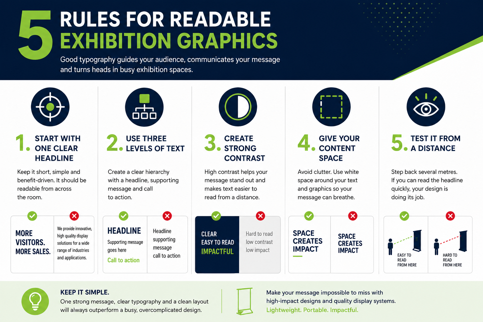
Your headline should always be the most prominent element on your display.
Visitors should be able to recognise your main message within a few seconds of approaching your stand. If they have to search for it, your design is working against you.
A strong headline should:
- Be short and easy to understand.
- Use a noticeably larger font than the supporting text.
- Contrast clearly with the background.
- Be positioned where it can be seen from a distance.
One simple test is to step back several metres from your artwork. If the headline immediately catches your eye, you’re on the right track.
Create Clear Differences Between Text Levels
One of the biggest mistakes in exhibition design is making every piece of text look equally important.
If your headline, subheading and body text all use similar font sizes or weights, visitors won’t know where to focus their attention.
Instead, create a clear hierarchy by varying:
- Font size.
- Font weight.
- Colour or contrast.
- Placement on the page.
Each level of information should feel distinct while still working together as part of the overall design.
Think of it as guiding the viewer through a conversation rather than asking them to read a page of text.
Less Copy Creates More Impact
It’s tempting to include as much information as possible on your exhibition graphics, but more text rarely leads to better communication.
Instead, focus on one key message and remove anything that doesn’t support it.
A good exhibition display should answer three simple questions:
- Who are you?
- What do you offer?
- Why should someone stop and speak to you?
Everything else can be discussed once visitors arrive at your stand.
Remember, your exhibition graphics are there to start conversations—not replace them.
Use White Space to Your Advantage
White space (sometimes called negative space) is simply the empty space around your text and graphics.
Many businesses see empty space as wasted space, but it’s actually one of the most valuable design tools available.
A clean layout allows important information to breathe, making your headline easier to notice and your overall message easier to understand.
Crowded designs often appear confusing, even when the information itself is good.
Giving your content room to breathe creates a more premium, professional appearance while improving readability.
Keep Alignment Consistent
Consistency is one of the easiest ways to make a display look polished.
Once you’ve chosen an alignment—whether left aligned, centred or right aligned—stick with it throughout the design.
Mixing different alignments without a clear reason can make the layout feel disorganised and force visitors to work harder to follow your message.
A consistent structure creates a natural reading path and helps guide the eye from your headline through to your supporting information and call to action.
Design for Different Viewing Distances
People don’t experience exhibition graphics from just one position.
Most visitors will first notice your display from across the exhibition hall before moving closer to learn more.
For that reason, every display should communicate at multiple distances.
From a distance, visitors should immediately recognise your headline and branding.
As they move closer, supporting messages become visible.
Only when they’re standing directly in front of your display should they begin reading detailed information such as product features, website addresses or QR codes.
Thinking about your design in layers helps ensure your display remains effective throughout the visitor’s journey.
Typography Is Only Part of the Picture
Even the best typography can struggle if it’s printed on poor-quality graphics or displayed on a system that doesn’t present it properly.
Wrinkled fabrics, distorted graphics or uneven display surfaces can reduce readability and make even well-designed artwork appear unprofessional.
That’s why it’s important to choose display systems that keep graphics smooth, tensioned and looking their best throughout an event.
At TRIGA® Display Systems, our portable fabric displays are designed to maintain crisp, professional graphics, ensuring your typography appears exactly as it was intended and your messaging remains clear from the moment your exhibition opens.
Test Your Design Before You Print
Even a well-designed exhibition graphic can fall short if it hasn’t been tested properly before going to print.
Before approving your artwork, take a step back and view it as your audience will. Can you immediately identify the main message? Is the text easy to read? Does the design feel clean and balanced?
If possible, ask someone unfamiliar with your business to look at the design for a few seconds. If they can quickly tell you what your company offers and what action you’d like them to take, your visual hierarchy is doing its job.
It’s also worth reviewing your artwork on different screen sizes or printing a scaled-down version. While this won’t perfectly replicate a full-size display, it can help you spot issues with spacing, alignment and readability before production begins.
A Simple Typography Checklist
Before sending your artwork to print, work through this quick checklist:
✓ Is your headline the first thing people will notice?
✓ Is the main message short, clear and easy to understand?
✓ Have you limited the number of fonts?
✓ Is there enough contrast between the text and the background?
✓ Does the design have enough white space?
✓ Can the headline be read from a distance?
✓ Are supporting details clearly separated from the main message?
✓ Is your call to action easy to find?
Taking a few extra minutes to review these points can make a significant difference to how your display performs at an exhibition or event.
Common Typography Mistakes to Avoid
Even experienced designers can make simple mistakes that reduce the impact of an exhibition display.
Some of the most common include:
- Using too many different fonts.
- Making every piece of text the same size.
- Writing long paragraphs that people won’t stop to read.
- Placing text over busy background images.
- Using colours with poor contrast.
- Trying to fit too much information onto one display.
- Forgetting to check how the design looks from a distance.
Keeping your message focused and your layout uncluttered will almost always produce a stronger result.
Frequently Asked Questions
What font works best for exhibition displays?
Clean sans-serif fonts such as Montserrat, Open Sans, Helvetica and Roboto are excellent choices for exhibition graphics. They’re easy to read from a distance and reproduce well across a range of print materials.
How much text should I include on an exhibition display?
Less is usually more. Your display should communicate one clear message that encourages people to stop and start a conversation. Detailed product information is better suited to brochures, digital presentations or discussions with your team.
How can I make my exhibition stand easier to read?
Use a clear headline, create a strong visual hierarchy, keep your messaging concise and ensure there is sufficient contrast between your text and background. Good spacing and a clean layout also improve readability.
Why is typography so important for exhibition graphics?
Typography helps visitors understand your message quickly. Clear, well-organised text guides the viewer’s attention, reinforces your branding and makes your display more engaging in busy exhibition environments.
Create Displays That Communicate Clearly
Your exhibition display has only a few moments to capture someone’s attention. Strong typography and a clear visual hierarchy help you make the most of that opportunity by ensuring visitors understand your message quickly and effortlessly.
By focusing on clear headlines, readable fonts, balanced layouts and concise messaging, you can create exhibition graphics that not only look professional but also encourage meaningful conversations with potential customers.
At TRIGA® Display Systems, we understand that great displays are about more than quality hardware. They’re about helping businesses communicate with confidence. Our range of portable banner stands, fabric displays and modular exhibition systems are designed to showcase your graphics at their very best, giving your brand the professional presence it deserves at every event.
Whether you’re designing your first exhibition stand or refreshing your existing graphics, thoughtful typography is one of the simplest and most effective ways to improve your display’s impact.